Branding
Deliverables
- Logo Design
- Labels Design
- Website Design
Objective
Earthcraft Brewing Co. is a fictional company, a new local brewery that utilizes sustainable practices and local organic ingredients to brew their beer. They require branding and labels that resonate with their target audience of eco-conscious adults who enjoy life by the lake. The assets needed include a logo, primary and secondary colour palettes, a website comprising three pages, and a series of labels.
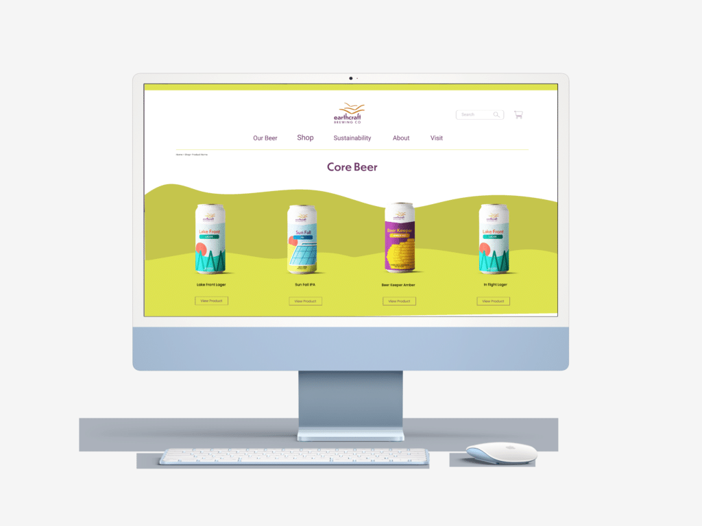
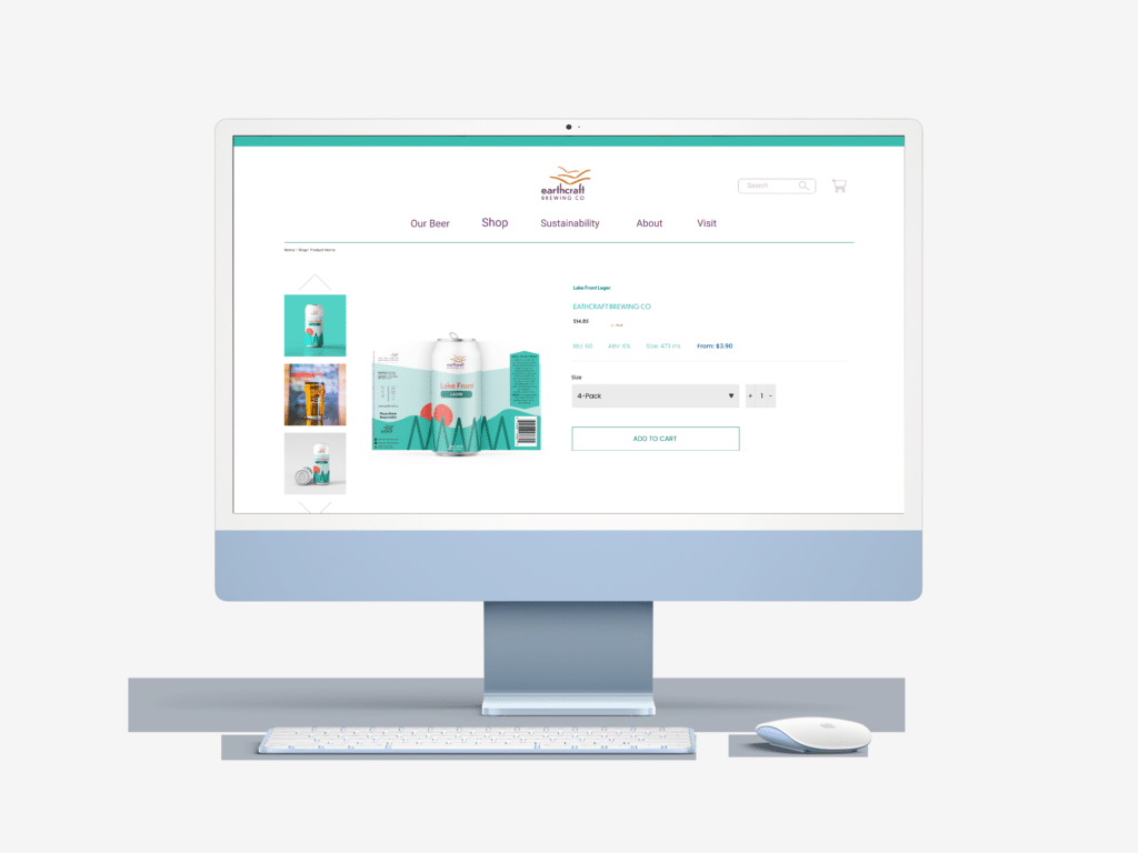
This project was originally a branding project completed in second year. During my final semester, I had the opportunity to revisit and enhance this project. While the symbol remained unchanged, the logotype and colours were updated. Additionally, improvements were made to the website, enhancing its flow and overall feel. Lastly, a series of beer can labels was incorporated.
Logo
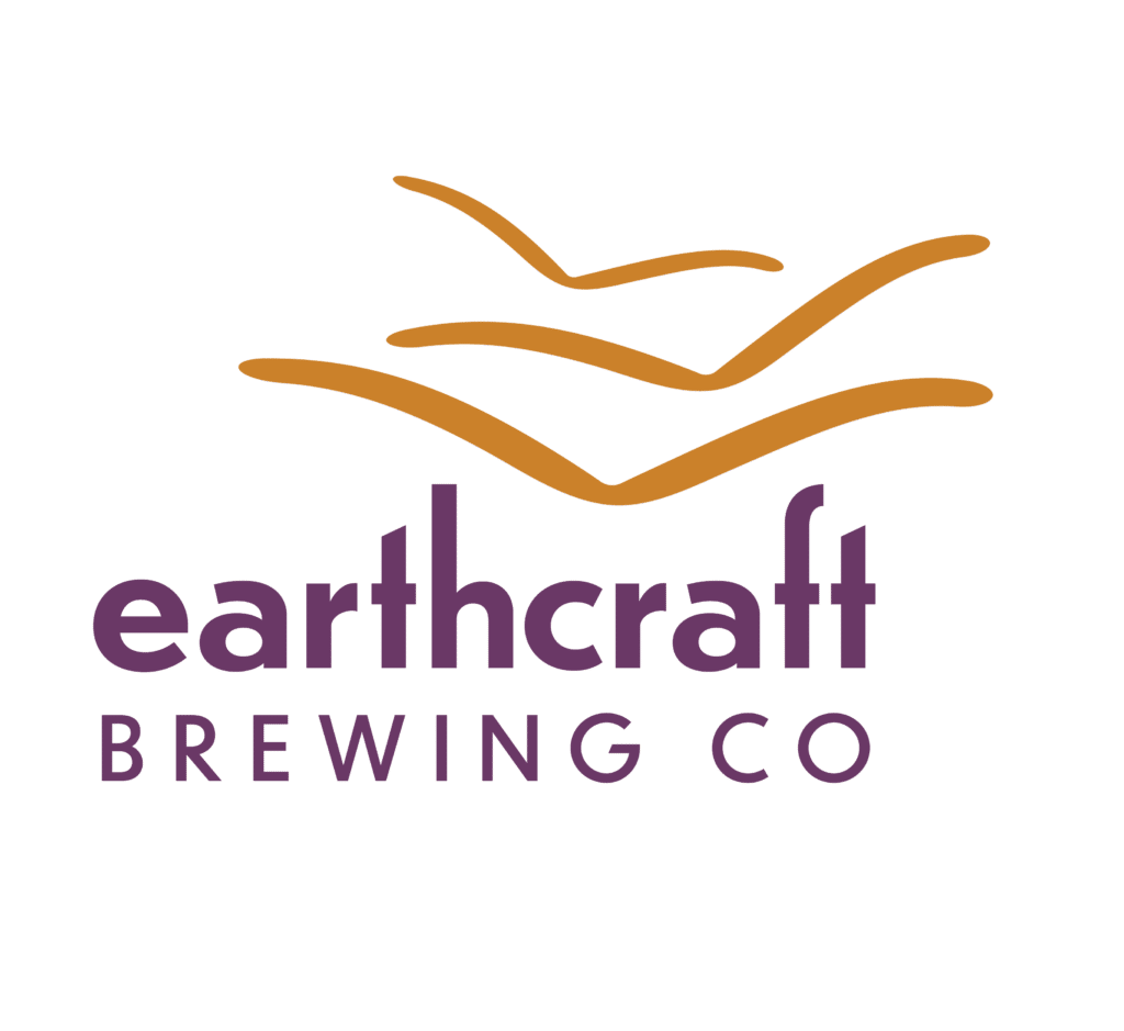
The symbol is made up of three curving shapes representing nature As these shapes are nebulous it allows the viewer to interpret them as a flight of birds or humps in a field of wheat. The logotype features tall ascenders, giving it a flowing quality that pairs well with the symbol. The symbol sits within a valley created by the type, resulting in an overall asymmetrical signature aligning with the nature of the brand.
The colour are approachable and give a causal feel resonating with the target audience, The gold colour symbolizes beer and wheat, while purple is used to maintain a friendly down-to-earth brand image.
Label Design
The illustrations on the cans are simply and a bit abstract, capturing the essence of elements associated with the brewery. The first two labels use the secondary colours to create bold eye-catching designs. The first label features a zigzag shape, representing the way hops grow on a trellis. Solar panels are illustrated on the second label, reflecting their commitment to sustainable practices. The last label uses the primary brand colours and an illustration of a beehive, an element from nature, one that must be protected. Each illustration is a reminder that this company has strong values to nature and the environment. The tops of the cans remain white with the logo positioned in the centre, creating a refreshing simple look to complement the design.
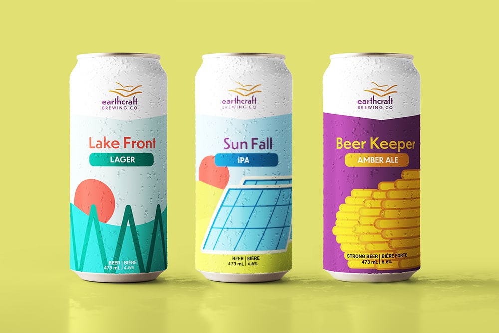
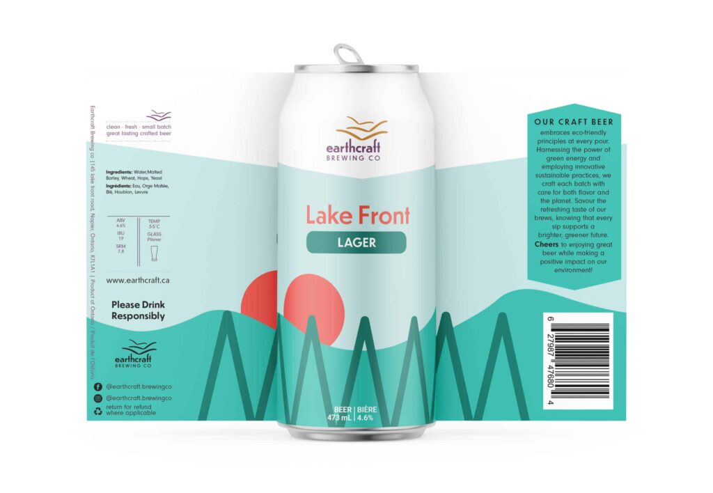
The overall designs form a cohesive series, remaining simple yet vibrant, similar yet distinct. They will stand out on a store shelf and the customer will be able to recognize their favourite beer. These labels have been created using the LLCBO standards with all necessary information such as, ingredients and alcohol content in both French and English.
